This GoDAM player appearance customization guide is for customizing player appearance for a single video, if you want to configure it globally for all videos, please check the video player customization settings documentation.
1. Volume Slider: You can switch this toggle to remove or display the video slider icon that helps in controlling the volume of the video
2. Display Captions: This toggle helps you remove or display the captions icon.
NOTE:
Even if the toggle is switched to display, it will only get displayed on the frontend if the user has uploaded captions in the video. To understand how to upload captions, refer this.
3. Show Branding: This option displays the brand image in the control bar. When toggled on, the GoDam logo is shown as the default brand image. You can further personalize it by uploading a custom image of your choice.

4. Play button position: By default play button appears at the center, but you can change it by using the dropdown menu.
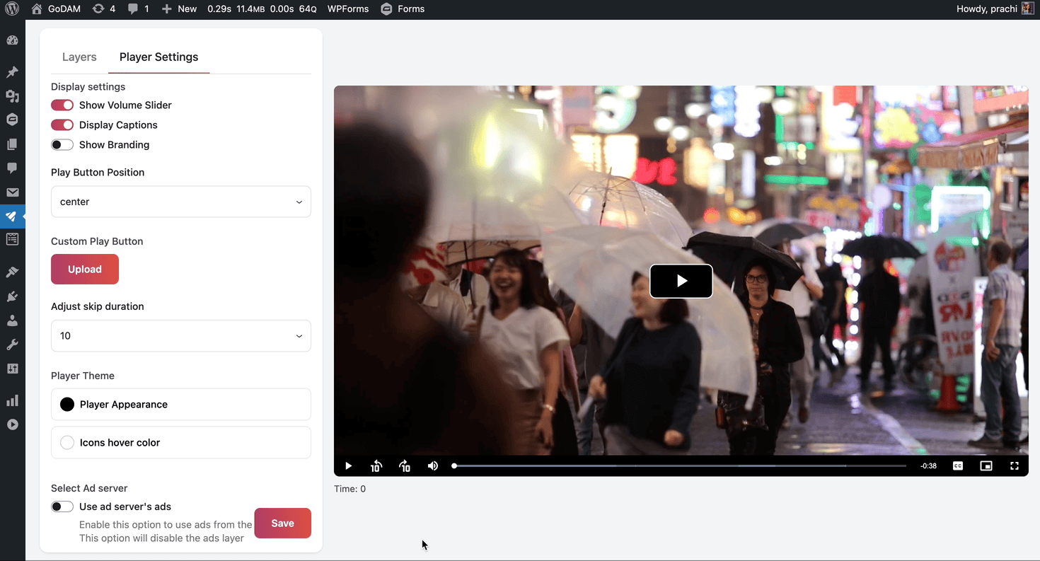
5. Custom Play Button: Upon loading, the default play button will appear. You can customize it by uploading a custom image, which will be displayed as the background of the play button.

6. Adjust skip duration: The skip duration is set to 10 seconds by default which can be changed to 5 or 30 seconds as well.
7. Player Theme
i) Player Appearance: Customize the player by selecting a custom color for the control bar and play button.
ii) Icons Hover color: Choose a custom color that will appear when hovering over the icons in the video control bar.
8. Select Ad server
To understand this setting, refer this documentation