
The Hotspot layer puts clickable spots on your video at the moment and place you choose. Viewers hover a hotspot to see its text and click it to open a link, such as a product page.
Each Hotspot layer has one Style for all its hotspots:
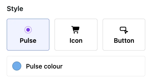
- Pulse: a pulsing circle that shows a tooltip on hover.
- Icon: a circle with an icon from the library, or your own image.
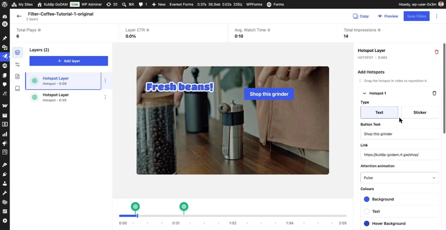
- Button (new in GoDAM 2.4): a clickable button, either Text or Sticker, with its own colours and attention animation.
You can add several hotspots to one layer, drag them anywhere on the video, and pause the video while viewers hover them. Every view, hover and click is counted in your layer analytics.
Add a Hotspot layer
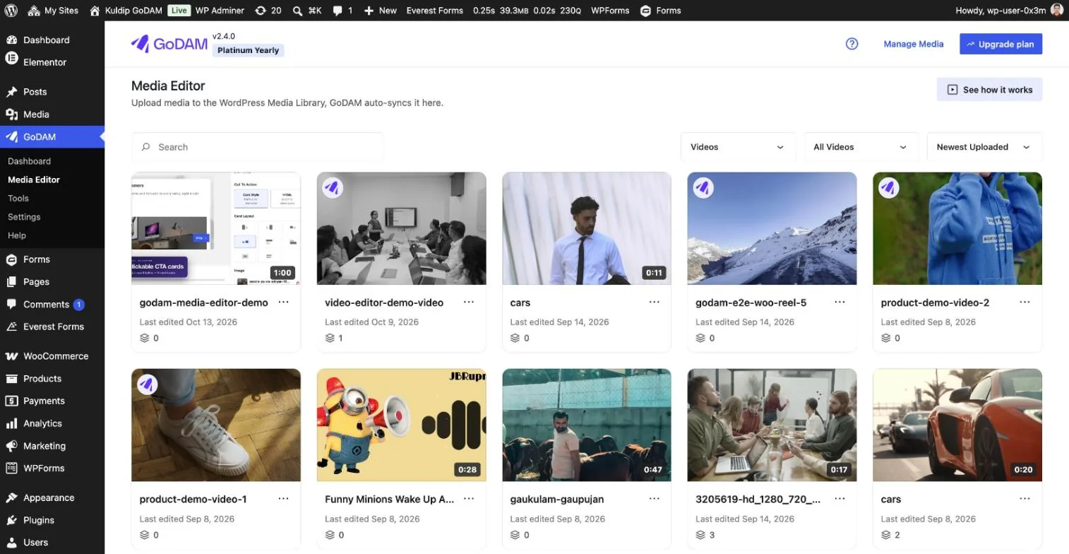
- In your WordPress admin, go to GoDAM → Media Editor and open the video you want to edit.
- On the timeline below the video, click the moment where the hotspots should appear.
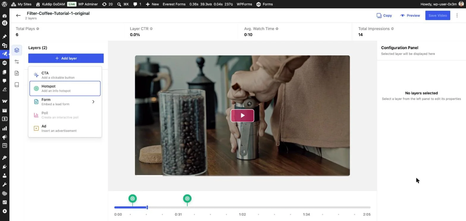
- Click Add layer at the top of the Layers panel, then choose Hotspot. The layer starts with one hotspot, labelled “New Hotspot”.
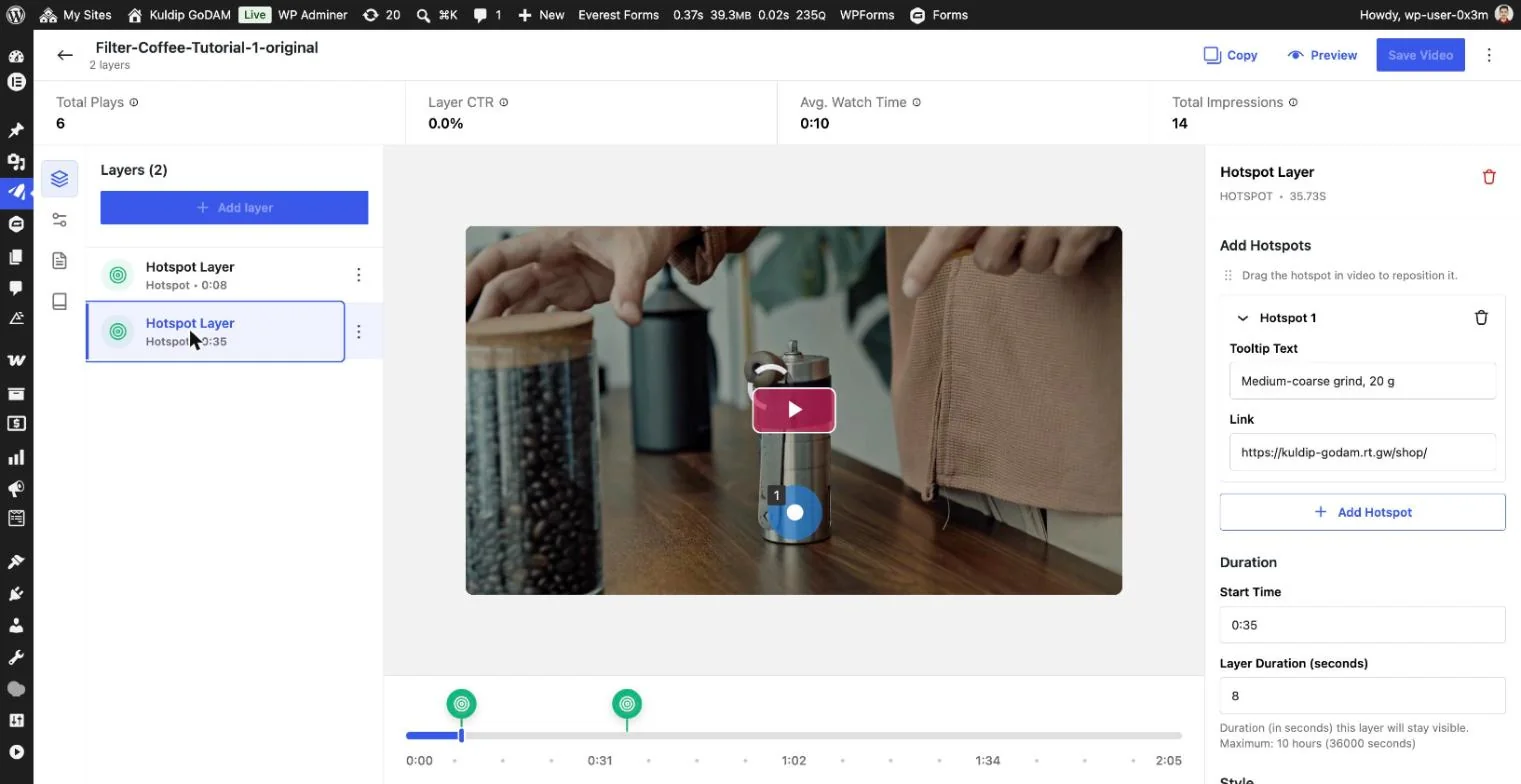
- In the Configuration Panel on the right, fill in the hotspot’s text and link (see the sections below).
- To add more hotspots to the same layer, click Add Hotspot.
- Click Save Video.
Choose a style
Pick the look under Style in the Configuration Panel. The style applies to every hotspot in the layer. To mix styles in one video, add another Hotspot layer.
| Style | What viewers see | Layer settings | Hotspot settings | Good for |
|---|---|---|---|---|
| Pulse | A pulsing circle. Hovering shows the tooltip. | Pulse colour | Tooltip Text, Link | Pointing at a detail without covering the video |
| Icon | A circle with an icon, such as a cart. Hovering shows the tooltip. | Add Icon (from the library, or upload your own image), Icon colour, Background colour | Tooltip Text, Link | Signalling the action, such as “buy” or “info” |
| Button | A button with its text always visible, styled as Text or Sticker | None. Each hotspot has its own look. | Type, Button Text, Link, Attention animation, colours | A clear call to action, such as “Shop this grinder” |
The Icon colour only applies to library icons. An uploaded image keeps its own colours.
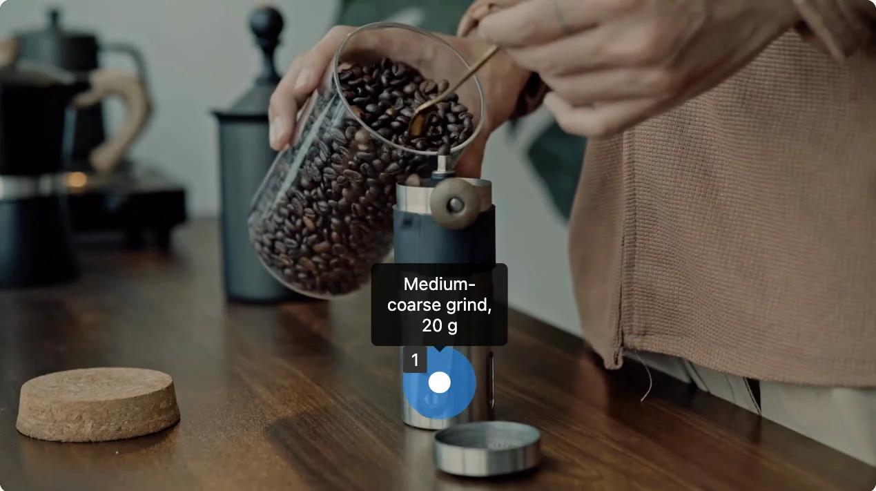
Button style (new in 2.4)
With Style set to Button, each hotspot shows as a button instead of a circle. Its text is always visible, so viewers don’t need to hover to see it. Set each button’s look in its hotspot card under Add Hotspots.
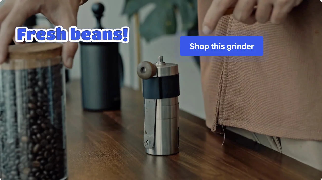
Button settings
| Setting | What it does |
|---|---|
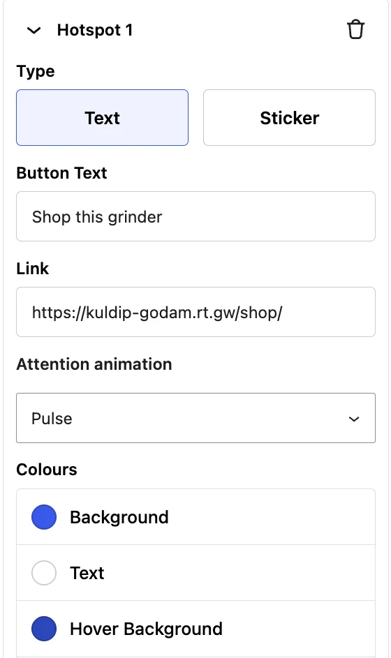
| Type | Text is a clean, rounded button. Sticker is a bold, die-cut label with a letter outline and a white border. |
| Button Text | The label on the button, such as “Shop this grinder”. |
| Link | The page the button opens, in a new tab. Use a full address starting with https://. |
| Attention animation | Draws the eye to the button: None, Pulse, Border waves or Glow. |
| Colours (Text type) | Background, Text, Hover Background and Hover Text. The defaults are a blue button (#3858E9) with white text that darkens on hover (#2C46BB). |
| Fill colour (Sticker type) | Fill, the colour of the sticker’s letters. |
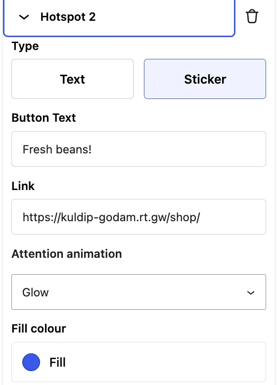
Attention animations
| Animation | What viewers see |
|---|---|
| None | The button stays still. |
| Pulse | The button gently grows and shrinks. |
| Border waves | Outlines ripple out from the button’s edge. |
| Glow | A soft glow pulses around the button. |
On a Sticker, the animations follow the outline of the letters rather than a box.
Tip: switching a Button layer back to Pulse or Icon turns the buttons back into circles at their earlier size. Your button text is kept as the tooltip text.
Position, size and timing
- Move a hotspot: drag it on the video to where you want it.
- Resize a hotspot: hover it, then drag its edge. Buttons resize the same way, and their text scales with them.
- On other screens: sizes are saved relative to the video’s width, so hotspots scale with the player on phones and large screens. Buttons always stay inside the video frame.
Under Duration in the Configuration Panel:
| Setting | What it does |
|---|---|
| Start Time | When the layer appears, for example 0:08. It starts at the timeline position where you added the layer. |
| Layer Duration (seconds) | How long the hotspots stay on screen. The default is 5 seconds and the maximum is 36,000 (10 hours). It can’t run past the end of the video. |
Behaviour, links and analytics
Pause on hover: under Behaviour, turn on Pause video when hotspot is hovered. While the layer is on screen, the video pauses when a viewer hovers a hotspot, so they have time to read it and click.
Links: enter a full web address, such as https://example.com/shop/. If the address isn’t valid, the editor shows “Please enter a valid URL”. On buttons, only http and https links open. Anything else, such as a javascript: link, shows the button without a link.
Analytics: GoDAM records when each hotspot is viewed, hovered and clicked, for all three styles. You’ll find these numbers in the video’s layer analytics. Layer CTR at the top of the editor shows the click-through rate for the video’s layers. See Single-video analytics.
Edit or delete hotspots
- Edit a layer: click it in the Layers list on the left. Its settings open in the Configuration Panel.
- Edit a hotspot: under Add Hotspots, click Hotspot 1, Hotspot 2 and so on to open its card.
- Delete a hotspot: click the bin icon next to the hotspot’s card.
- Delete the whole layer: click the bin icon at the top of the Configuration Panel.
Click Save Video to keep your changes.
FAQs
Can I mix Text buttons and Stickers in one layer?
Yes. Type is set per hotspot, so one layer can hold both.
Can I mix Pulse and Button hotspots in one layer?
No. Style applies to the whole layer. Add a second Hotspot layer for the other style. Both layers can be on screen at the same time.
What happens to hotspots I made before GoDAM 2.4?
They keep working. When you open an older layer, the editor moves its look into the layer’s Style. It uses Pulse, or Icon if the layer used an icon, and takes the colour from the first hotspot.
Why doesn’t my button open its link?
Check that the Link is a full address starting with https://. On buttons, other kinds of links are ignored.