Video player
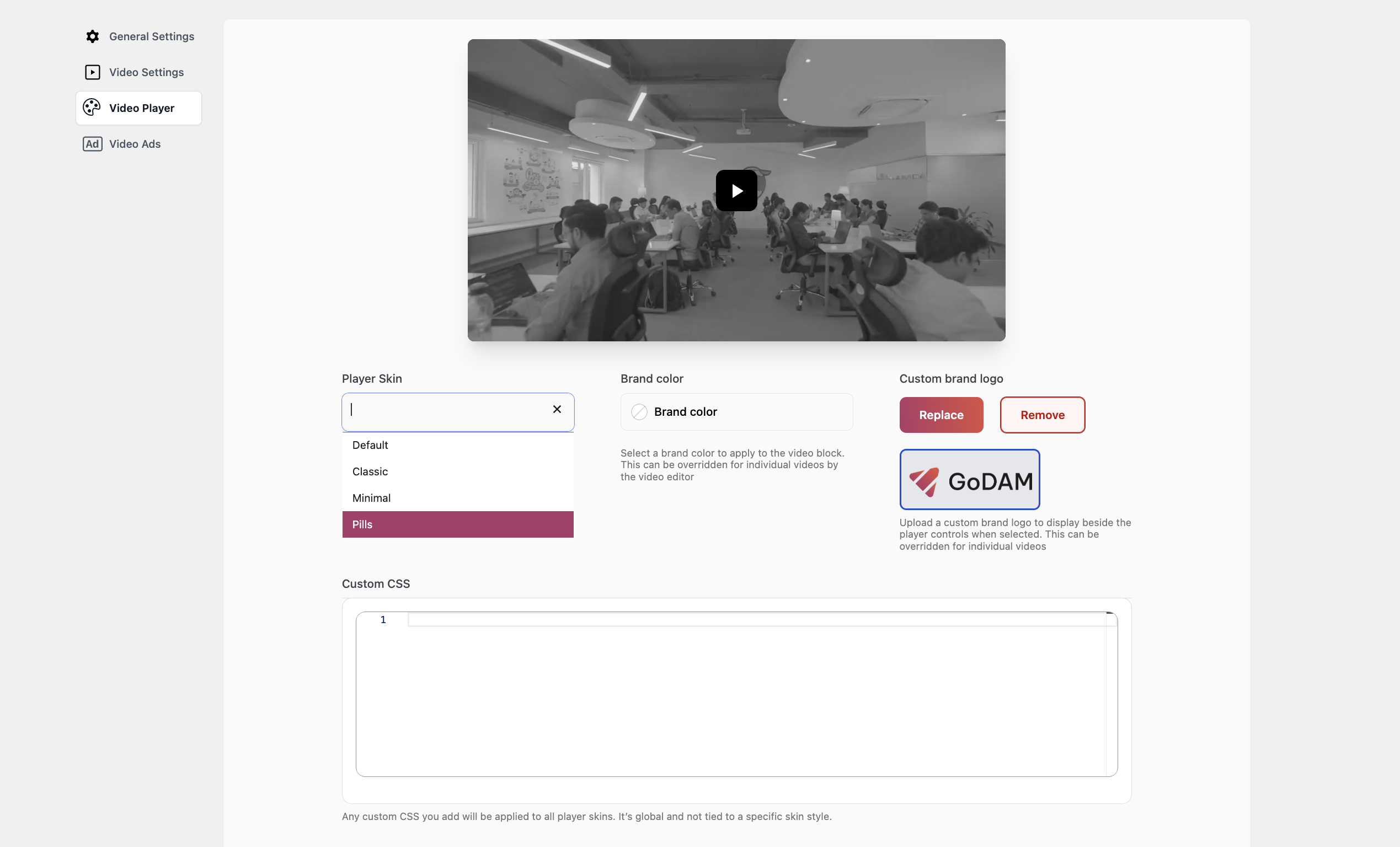
Customize the look and feel of your video player using the settings below. These options allow you to apply a skin, add branding elements, and include global CSS styles across all players on your site.
1. Player Preview:
At the top of the screen, a live video preview shows how your selected player skin and branding will appear in action. This preview updates automatically based on your customization settings.
2. Player Skin:
It lets you choose the overall style or theme for your video player. Skins define the layout, controls, and general visual design.
3. Brand Color:
To match your player to your brand, you can specify a Brand Color using the color picker provided. A warning message appears below the picker if your chosen skin does not reflect these color changes, helping to set expectations.
Override: This setting can be customized per video using the video editor.
4. Brand Logo:
You can also upload a Custom Brand Logo to personalize the player further. This logo could appear within the player interface, but again, its visibility depends on the skin’s and video’s support for branding. Options are available to replace or remove the logo at any time. Just like the brand color, unsupported skins will not display the logo, and a message beneath the setting will alert you when that’s the case.
Note: Brand Logo is only visible if the setting is toggled on in Appearance Customization. To know more refer “Show Branding” section on this.
5. Custom CSS:
For advanced users, a Custom CSS field is available at the bottom of the panel. This field allows you to inject your own CSS styles, which apply globally across all video players on your site regardless of the selected skin. You can use this to fine-tune styles, hide elements, override fonts, adjust spacing, or fully customize the look of the player to align with your design system.
Note: Changes made here affect all players, not just one skin or video.
You can use the following placeholder CSS as a starting point to style your Video Player. It includes commonly used class selectors from Video.js, allowing you to easily customize the appearance of player controls, buttons, and overlays:
   // Video Player Wrapper
    .video-js {
        // Styles for the overall video player
    }

    // Video Element Parent Div
    .easydam-video-container {
        // Styles for the video element parent div
    }

    // Video Element
    .video-js video {
        // Styles for the actual video element
    }

    // Big Play Button
    .video-js .vjs-big-play-button {
        // Styles for the central play button
    }

    // Control Bar
    .video-js .vjs-control-bar {
        // Styles for the control bar container
    }

    // Play/Pause Button
    .video-js .vjs-play-control {
        // Styles for play/pause button
    }

    // Volume Controls
    .video-js .vjs-volume-panel {
        // Styles for volume control group
    }
    .video-js .vjs-mute-control {
        // Styles for mute/unmute button
    }
    .video-js .vjs-volume-level {
        // Styles for the volume level bar
    }

    // Progress Bar
    .video-js .vjs-progress-control {
        // Styles for the progress bar container
    }
    .video-js .vjs-play-progress {
        // Styles for the played portion of the progress bar
    }
    .video-js .vjs-load-progress {
        // Styles for the buffered portion
    }

    // Current Time / Duration Display
    .video-js .vjs-current-time,
    .video-js .vjs-duration {
        // Styles for time displays
    }

    // Fullscreen Button
    .video-js .vjs-fullscreen-control {
        // Styles for fullscreen toggle
    }

    // Captions Button
    .video-js .vjs-captions-button {
        // Styles for captions/subtitles button
    }

    // Custom Settings Menu (if added)
    .video-js .vjs-settings-button {
        // Styles for custom settings menu button
    }

    // Poster Image
    .video-js .vjs-poster {
        // Styles for the video poster (preview image before playback)
    }

    // Loading Spinner
    .video-js .vjs-loading-spinner {
        // Styles for the buffering/loading animation
    }

    // Error Display
    .video-js .vjs-error-display {
        // Styles for the error overlay if playback fails
    }
Aspect ratio perseverance
GoDAM now automatically preserves the original aspect ratio of every uploaded media file, ensuring your visuals display exactly as intended without making any changes. Whether your content is in 16:9, 9:16, 1:1, or 9:25, GoDAM detects and maintains the correct ratio during processing, playback, and embedding – giving you consistent presentation across pages, devices, and player layouts.
If you face any issues, please contact our support.
